
Como podréis ver, la revolución móvil ha llegado. Ha llegado el momento de construir aplicaciones web móviles para tus proyectos web. Muchas plataformas de terceros, como Apache Córdoba y Phonegap te ofrecen todo lo necesario para poder convertir tus aplicaciones web en aplicaciones móviles nativas. En este tutorial te ayudaremos a diseñar un botón switch estilo iOS mediante HTML, CSS y jQuery. Especialmente me encantan los pseudo elementos CSS: before y: after, ya que te ayudan a reducir al mínimo el código HTML. ¿Quieres saber cómo diseñar este estilo de botón? Pues estate atento...
Código HTML
Debes incluir un checkbox y div llamado switch dentro del tag label.
<label>
<input type="checkbox" name="checkboxName" class="checkbox"/>
<div class="switch"></div>
</label>
Contenedor switch
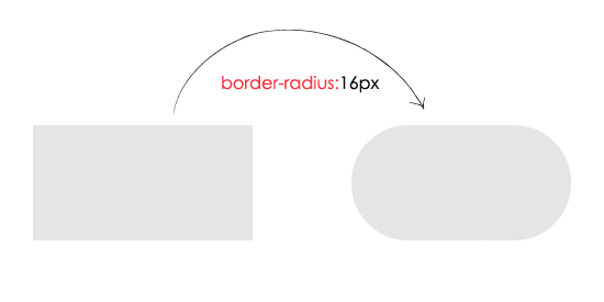
Vamos a dar estilo al contenedor switch
.switch
{
width: 62px;
height: 32px;
background: #E5E5E5;
z-index: 0;
margin: 0;
padding: 0;
appearance: none;
border: none;
cursor: pointer;
position: relative;
border-radius:16px; //IE 11
-moz-border-radius:16px; //Mozilla
-webkit-border-radius:16px; //Chrome and Safari
}
Después de aplicar el código del border-radius.
Switch before
El :before es un pseudo elemento, inserta estilo/contenido antes del elemento DOM
.switch:before
{
content: ' ';
position: absolute;
left: 1px;
top: 1px;
width: 60px;
height: 30px;
background: #FFFFFF;
z-index: 1;
border-radius:16px; //IE 11
-moz-border-radius:16px; //Mozilla
-webkit-border-radius:16px; //Chrome and Safari
}

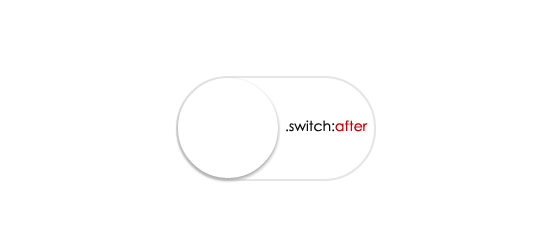
Switch after
El :after es un pseudo elemento, inserta estilo/contenido después del elemento DOM. Aquí, la duración de la transición ayuda a enriquecer el efecto de la animación.
.switch:after
{
content: ' ';
height: 29px;
width: 29px;
border-radius: 28px;
z-index: 2;
background: #FFFFFF;
position: absolute;
-webkit-transition-duration: 300ms;
transition-duration: 300ms;
top: 1px;
left: 1px;
-webkit-box-shadow: 0 2px 5px #999999;
box-shadow: 0 2px 5px #999999;
}
SwitchOn :after :before
Aplica el color de fondo a verde y lo mueve
.switchOn , .switchOn:before
{
background: #4cd964 !important;
}
.switchOn:after
{
left: 21px !important;
}

jQuery
En la sentencia $('.switch').click(function(){}, switch es el nombre de la case del DIV. Utilizando jQuery toggleClass añadimos y eliminamos la clase switchOn cuando hacemos clic con el ratón.
<script src="http://ajax.googleapis.com/ajax/libs/jquery/2.1.1/jquery.min.js"></script>
<script>
$(document).ready(function()
{

$('.switch').click(function()
{
$(this).toggleClass("switchOn");
});

});
</script>
CSS Final
Puedes ocultar el input checkbox utilizando display:none
.checkbox{display:none}
.switch
{
width: 62px;
height: 32px;
background: #E5E5E5;
z-index: 0;
margin: 0;
padding: 0;
appearance: none;
border: none;
cursor: pointer;
position: relative;
border-radius:16px; //IE 11
-moz-border-radius:16px; //Mozilla
-webkit-border-radius:16px; //Chrome and Safari
}
.switch:before
{
content: ' ';
position: absolute;
left: 1px;
top: 1px;
width: 60px;
height: 30px;
background: #FFFFFF;
z-index: 1;
border-radius:16px; //IE 11
-moz-border-radius:16px; //Mozilla
-webkit-border-radius:16px; //Chrome and Safari
}
.switch:after
{
content: ' ';
height: 29px;
width: 29px;
border-radius: 28px;
background: #FFFFFF;
position: absolute;
z-index: 2;
top: 1px;
left: 1px;
-webkit-transition-duration: 300ms;
transition-duration: 300ms;
-webkit-box-shadow: 0 2px 5px #999999;
box-shadow: 0 2px 5px #999999;
}
.switchOn , .switchOn:before
{
background: #4cd964 !important;
}
.switchOn:after
{
left: 21px !important;
}
Fuente: 9lessons.info