Las barras de progreso se han vuelto muy populares últimamente y, existen un montón de plugins que pueden ayudarte a agregar una en tu sitio web. Pero, ¿cómo puedes hacer la tuya propia? El problema es que hay un montón de implementaciones ya hechas, así que en este sencillo tutorial vamos a desarrollar algo diferente, algo que se salga de la norma... Ok, se me ha ocurrido algo. ¿Qué tal si llevamos a cabo unos botones con barras de progreso integradas?
Serán perfectos para mostrar el progreso de diversas tareas como el envío de formularios o cargar contenido mediante AJAX. Para ello utilizaremos transiciones y estilos de CSS3 para que sea más sencillo de personalizar.
EL HTML
En la primera sección del tutorial vamos a llevar a cabo el diseño HTML. Se trata de un documento estándar HTML5 que incluye dos recursos adicionales de los que hablaremos más adelante, la hoja de estilo styles.css y el archivo de Javascript script.js. Además, también he incluido la librería jQuery, y la fuente de Google Fonts, Raleway.
<!DOCTYPE html>
<html>
<head>
<meta charset="utf-8"/>
<title>Tutorial: Buttons with built-in progress meters</title>
<link href="http://fonts.googleapis.com/css?family=Raleway:400,700" rel="stylesheet" />
<!-- The Stylesheets -->
<link href="assets/css/style.css" rel="stylesheet" />
</head>
<body>
<h1>Progress Buttons</h1>
<a id="submitButton" href="#" class="progress-button">Submit</a>
<a id="actionButton" href="#" class="progress-button green" data-loading="Working.." data-finished="Finished!" data-type="background-bar">Action!</a>
<a id="generateButton" href="#" class="progress-button red" data-loading="Generating.." data-finished="Download" data-type="background-vertical">Generate</a>
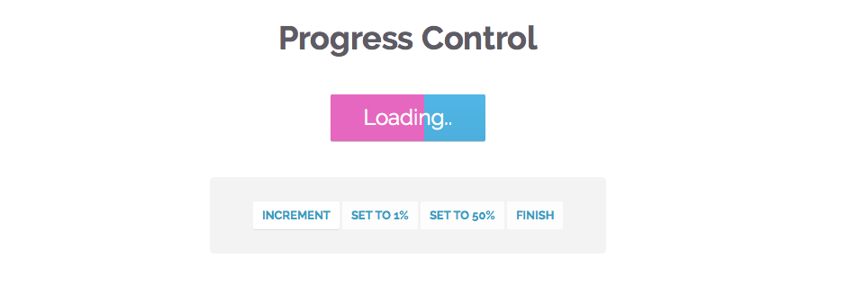
<h1>Progress Control</h1>
<a id="controlButton" href="#" class="progress-button">Start</a>
<div class="control-area">
<a class="command increment">Increment</a>
<a class="command set-to-1">Set to 1%</a>
<a class="command set-to-50">Set to 50%</a>
<a class="command finish">Finish</a>
</div>
<script src="http://cdnjs.cloudflare.com/ajax/libs/jquery/1.10.2/jquery.min.js"></script>
<script src="assets/js/script.js"></script>
</body>
</html>
La plantilla es bastante simple. Los botones de progreso se han definido como hipervínculos normales. Con el fin de ser reconocidos por el plugin y convertidos en botones con función de barras de progreso, necesitan tener la clase .progress-button. Los botones también se pueden configurar mediante la configuración de tres atributos data-*:
data-type: Especifica qué tipo de barra de progreso se mostrará. Actualmente existen tres tipos: background-horizontal (por defecto), background-bar y background-vertical.
data-loading: Epecifica el texto que se mostrará mientras la barra de progreso se esté moviendo. El valor por defecto es Loading...
data-finished: Especifica el texto que del botón cuando se termine el progreso. El valor por defecto es Done!
El código jQuery
En esta parte del tutorial, vamos a escribir el código JavaScript y jQuery para hacer que los botones funcionen. El código está organizado como 6 plugins jQuery que comparten un nombre común: progressInitialize, progressStart, progressIncrement, progressTimed, progressSet y progressFinish. Hay un montón de comentarios en el código, pero debes saber inglés para interpretarlos:
$(document).ready(function(){
// Convert all the links with the progress-button class to
// actual buttons with progress meters.
// You need to call this function once the page is loaded.
// If you add buttons later, you will need to call the function only for them.
$('.progress-button').progressInitialize();
// Listen for clicks on the first three buttons, and start
// the progress animations
$('#submitButton').click(function(e){
e.preventDefault();
// This function will show a progress meter for
// the specified amount of time
$(this).progressTimed(2);
});
$('#actionButton').click(function(e){
e.preventDefault();
$(this).progressTimed(2);
});
$('#generateButton').one('click', function(e){
e.preventDefault();
// It can take a callback
var button = $(this);
button.progressTimed(3, function(){
// In this callback, you can set the href attribute of the button
// to the URL of the generated file. For the demo, we will only
// set up a new event listener that alerts a message.
button.click(function(){
alert('Showing how a callback works!');
});
});
});
// Custom progress handling
var controlButton = $('#controlButton');
controlButton.click(function(e){
e.preventDefault();
// You can optionally call the progressStart function.
// It will simulate activity every 2 seconds if the
// progress meter has not been incremented.
controlButton.progressStart();
});
$('.command.increment').click(function(){
// Increment the progress bar with 10%. Pass a number
// as an argument to increment with a different amount.
controlButton.progressIncrement();
});
$('.command.set-to-1').click(function(){
// Set the progress meter to the specified percentage
controlButton.progressSet(1);
});
$('.command.set-to-50').click(function(){
controlButton.progressSet(50);
});
$('.command.finish').click(function(){
// Set the progress meter to 100% and show the done text.
controlButton.progressFinish();
});
});
// The progress meter functionality is available as a series of plugins.
// You can put this code in a separate file if you wish to keep things tidy.
(function($){
// Creating a number of jQuery plugins that you can use to
// initialize and control the progress meters.
$.fn.progressInitialize = function(){
// This function creates the necessary markup for the progress meter
// and sets up a few event listeners.
// Loop through all the buttons:
return this.each(function(){
var button = $(this),
progress = 0;
// Extract the data attributes into the options object.
// If they are missing, they will receive default values.
var options = $.extend({
type:'background-horizontal',
loading: 'Loading..',
finished: 'Done!'
}, button.data());
// Add the data attributes if they are missing from the element.
// They are used by our CSS code to show the messages
button.attr({'data-loading': options.loading, 'data-finished': options.finished});
// Add the needed markup for the progress bar to the button
var bar = $('
progressInitialize establece un detector de eventos para el evento personalizado de progreso que las otras funciones llaman cada vez que el medidor necesita ser actualizado. Gracias al evento personalizado, puedes tener funciones totalmente independientes como progressStart, que gestiona su propio temporizador y el estado.
Otra cosa importante es que estamos estableciendo dos clases especiales en los botones, .in-progress mientras el indicador de progreso se está moviendo, y .finished cuando se ha terminado. Estas se utilizan para actualizar el texto de los botones, como verás en la siguiente sección.
El CSS
Antes he mencionado que hemos establecido dos clases CSS para los botones: .in-progress y .finished. Pero, ¿cómo cambiaremos el texto del botón añadiendo una de estas clases? Simple, usaremos un truco de CSS que tiene que ver con el operador attr de CSS3, que cuando se combina con el contenido, puedes establecer el texto de un pseudo elemento :before o :after al atributo de un elemento. Será más claro una vez que lo veas por tí mismo:
.progress-button{
	display: inline-block;
	font-size:24px;
	color:#fff !important;
	text-decoration: none !important;
	padding:14px 60px;
	line-height:1;
	overflow: hidden;
	position:relative;

	box-shadow:0 1px 1px #ccc;
	border-radius:2px;

	background-color: #51b7e6;
	background-image:-webkit-linear-gradient(top, #51b7e6, #4dafdd);
	background-image:-moz-linear-gradient(top, #51b7e6, #4dafdd);
	background-image:linear-gradient(top, #51b7e6, #4dafdd);
}

/* Hide the original text of the button. Then the loading or finished
   text will be shown in the :after element above it. */

.progress-button.in-progress,
.progress-button.finished{
	color:transparent !important;
}

.progress-button.in-progress:after,
.progress-button.finished:after{
	position: absolute;
	z-index: 2;
	width: 100%;
	height: 100%;
	text-align: center;
	top: 0;
	padding-top: inherit;
	color: #fff !important;
	left: 0;
}

/* If the .in-progress class is set on the button, show the
   contents of the data-loading attribute on the butotn */

.progress-button.in-progress:after{
	content:attr(data-loading);
}

/* The same goes for the .finished class */

.progress-button.finished:after{
	content:attr(data-finished);
}

/* The colorful bar that grows depending on the progress */

.progress-button .tz-bar{
	background-color:#e667c0;
	height:3px;
	bottom:0;
	left:0;
	width:0;
	position:absolute;
	z-index:1;

	border-radius:0 0 2px 2px;

	-webkit-transition: width 0.5s, height 0.5s;
	-moz-transition: width 0.5s, height 0.5s;
	transition: width 0.5s, height 0.5s;
}

/* The bar can be either horizontal, or vertical */

.progress-button .tz-bar.background-horizontal{
	height:100%;
	border-radius:2px;
}

.progress-button .tz-bar.background-vertical{
	height:0;
	top:0;
	width:100%;
	border-radius:2px;
}
Y eso sería todo. Espero que sepáis aplicar estos botones en vuestros proyectos.
Fuente: tutorialzine.com